New Developer Blog Series Vol. 1 - Data Visualization and Analysis


Introduction
This developer blog will cover visualization and analysis topics.
In my experience, I have seen many cases where data visualization and analysis did not go as expected.
Especially if your visualization and analytics maturity is still in development
- Lack of basic understanding to interpret numbers
- Although they have a sense of numbers, they cannot explain that sense logically.
In cases like this, the first step is to put into words even things that are taken for granted and to have a common understanding.
Vol.01Data visualization is ○○○○
This time, we will not be talking about technical topics, but rather about some basic but important aspects of visualization and analysis.
Data visualization is a health check
This isn't a metaphor for "revealing the health of a company."
For customers who are thinking about starting visualization or who have started but are having trouble
There will be an opportunity to talk about "what are the key points when it comes to visualization?"
In such situations, I like to explain the key points by comparing them to a health checkup, so I would like to introduce them to you.
The purpose of visualization is
- Get a timely grasp of the figures and KPI achievement status required for daily business activities
- Analytical use to gain insights
These can be broadly divided into two categories, but this article will mainly focus on the former.

Think back to the results of your health checkup.
First, there is the overall assessment. You may remember that you needed to be retested.
It also listed whether the results were normal or abnormal for each category, such as blood or liver function.
I remember a senior colleague telling me, "I drank too much alcohol and my y-GTP level was twice the allowable value."
In many cases, a separate sheet is attached that explains the numbers and provides guidance for improvement.
If your y-GTP levels are abnormal, I think it will say something along the lines of, ``You should avoid alcohol and carbohydrates.''
What I have written so far is packed with important elements of visualization.
There is a comprehensive assessment
>For each classification, whether it is normal or abnormal is listed.
You can visually see whether it is good or bad overall, and whether each element is good or bad when broken down.
The dashboard first lets you know whether you need to check something or not.
If you need to check something, it's even more important to be able to instantly determine where you should focus your attention.
*At this point, it's best to forget about treating numbers fairly or our favorite MECE.
(I'll write about this another time.)
>y-GTP is twice the allowable value
The comparison targets and numerical values, such as average values and standard values, are clearly displayed, so you can see how your results compare to those.
When numbers show a cross-section (a snapshot of the state at a certain point in time), they only become meaningful when compared to something.
The comparison can be with target values, previous year's values, or the figures of neighboring teams, but making the comparison (looking at discrepancies) will lead to further analysis.
>It contains explanations of the figures and guidance for improvement.
It's clear what action to take.
The need to "visualize" is the drill in the drill hole theory.
Ideally, we want to visualize the issues so that they become clear and anyone can quickly make decisions about what actions to take.
"At the moment" I am a driller, so I sell drills, but I want to keep in mind what it is that people really want (a hole) and how to achieve that with a drill.
Finally, a health checkup consists of the results of multiple tests (blood, X-rays, etc.).
Simply visualizing the information obtained from a single system does not mean that you are making full use of it.
In terms of a health checkup, this would be like visualizing only the results of physical measurements.
Only by combining information obtained from multiple systems can we gain new insights and gain a more accurate understanding of the situation.
To do this, an analytical platform is needed.
Now, let's visualize it
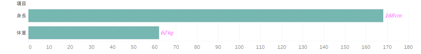
Since I used a health checkup as an example, I created a graph using Tableau.
First of all, this is a bad example. What could be the problem?
The most common opinion seems to be about the fact that height and weight are shown side by side in bar graphs.
Bar graphs are used to compare adjacent elements, so using bars to compare height and weight, which are not comparable, is meaningless.
This is about how to express things in an easy-to-understand way.
You can probably find a fair number of articles on the web about how to express things.
There are probably many other points that could be made, but the ones I personally would like to mention are as follows:
"Why is height and weight listed but not BMI?"
It cannot be said that not including BMI is necessarily a "bad thing," but as we continue to visualize and analyze this data, there will undoubtedly be times when we will have to stop and think.
I'll tell you more about that next time.
When working with data, it is important to use your imagination and form hypotheses.
Please try to imagine it. (There are hints in this article.)
The person who wrote the article