Visualize the results of your data analysis in an easy-to-understand way! ~ A comprehensive guide to dashboard basics and how to use them ~


In recent years, the importance of in-house data analysis has increased across all industries and business types.
It's important not just to collect data, but to share the analysis results quickly and accurately and to consider how to link them to improvements in management and policies. This is where dashboards come in handy, as they provide intuitive, real-time information.
This article provides an easy-to-understand explanation of the basic functions and benefits of using dashboards, as well as specific tools and use cases. We've compiled important points for anyone aiming to become a data-driven organization, so please read to the end.
What is a dashboard anyway?
First, let's understand what a dashboard is and what role it plays.
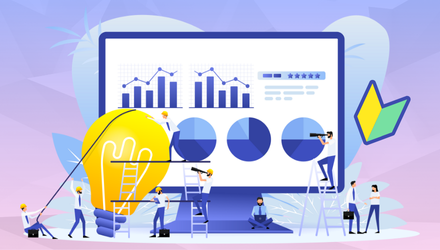
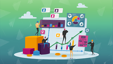
A dashboard is a system for visually organizing and displaying large amounts of data in real time. In business, there is a wide variety of data, from sales and inventory to personnel information, but by consolidating this data in a centralized and easy-to-read format, it is possible to grasp the situation and speed up decision-making.
The difference between dashboards and reports, which are often confused with them, is that dashboards are dynamic and the displayed content changes automatically every time the data is updated. Reports are generally static and are updated at set intervals, such as monthly or weekly reports, but dashboards always reflect the latest data and provide real-time information.
This allows a wide range of people, not just executives and managers, but also marketing staff and field staff, to instantly understand the situation. The greatest feature of dashboards is that they make it easier to apply the results of data analysis to practical work.
The relationship between dashboards and BI tools
We will explain the connection with BI tools, which is important when utilizing dashboards.
BI (Business Intelligence) tools are systems or software that integrate and analyze various data held by a company to support decision-making. Dashboards are one of the important functions that provide visualization in BI tools.
In the past, analysts often manually extracted and processed data to create reports, but by introducing BI tools, the analysis and visualization process can be made much more efficient.The key to integrating BI tools and dashboards is to automatically import numbers by linking with specific data sources and converting them into graphs and charts.
In addition, BI tools may also be equipped with predictive analysis functions that combine machine learning and artificial intelligence. By making these advanced analysis results available on a dashboard, you can instantly obtain a wide range of information that is useful for management and policy planning.
Dashboard Key Features
Dashboards have a variety of functions, and understanding them is extremely important when considering how to handle data and how to use it in decision-making. Here, we will explain the four most important functions.
1. Various visualization functions (graphs and charts)
Data can be visualized in a variety of formats, including line graphs, bar graphs, pie charts, etc. By using different graph shapes, it becomes easier to grasp characteristics such as numerical trends and composition ratios at a glance.
For example, if you visualize sales trends in a line graph and the product composition ratio in a pie chart at the same time, you can easily see overall fluctuations and their causes. In business analysis, not only is data accuracy important, but it is also important to present data in an intuitive way.
By creating a visually easy-to-understand dashboard, it becomes easier to absorb the differences in data literacy among stakeholders and create an environment where everyone can share the same information.
2. Alert notifications and real-time data integration
The ability to automatically send alerts when a certain indicator exceeds a threshold is essential for early detection and rapid response to problems, eliminating the need for personnel to constantly check the dashboard.
Real-time data integration helps to instantly reflect information that changes every moment, such as inventory, sales, and social media reactions. If the information update is delayed by even a few hours, there is a risk that the timing of a good measure will be missed and a decision will be made.
By introducing a dashboard, you can create a system that will trigger an alert as soon as the data changes, allowing you to make management decisions and review policies quickly.
3. Drill-down/drill-through function
The drill-down feature allows you to drill down to more detailed data by clicking on graphs and charts on the dashboard. You can see the changes in each specific item and determine why the values of the top indicators increased or decreased.
The drill-through feature allows you to directly access other data sources and related reports for more in-depth analysis. For example, you can consistently link overall sales data to detailed data by region or product.
These functions make it easier to explore the "why" behind simple increases and decreases in numerical values. This is also an extremely effective means of verifying hypotheses and formulating strategies.
4. Simulation function
Simulation functions that allow you to estimate future sales forecasts and inventory demand on a dashboard are extremely useful for improving the accuracy of business plans and initiatives. When linked to a BI tool, it may be possible to display the results of a predictive model that uses past data as is.
For example, you can make careful and speedy decisions by predicting the impact of price revisions or estimating sales changes when a new campaign is launched. You can also set up multiple scenarios in advance and easily switch between them on the dashboard for comparison.
In this way, by utilizing the simulation function, you can not only analyze the current situation, but also take a more forward-looking strategic approach.
By making good use of each function, you can quickly share information on-site and solidify management direction.
By utilizing these tools comprehensively, you will be able to view data from multiple perspectives.
In particular, the expressive power and real-time nature of visualization can be an ideal means of smooth communication across teams. By incorporating dashboards into daily work, everyone can quickly understand the results of data analysis and take appropriate action.
Benefits and points to note when introducing dashboards
While there are many benefits to implementing dashboards, there are also some things to be aware of.
Any company or organization uses a wide variety of data. One of the major benefits of dashboards is that they aggregate this diverse data and allow for an immediate understanding of the situation, but implementing them requires selecting the right tools and establishing an operational system.
In particular, when multiple departments share data, it is necessary to standardize the granularity and definitions of the data used for analysis. Otherwise, data that is interpreted differently by each department will be mixed together, which could actually increase the risk of misunderstandings.
While real-time information can be obtained, the cost of implementing the tool, licensing fees, and the man-hours required for operation and maintenance must also be taken into consideration. It is important to comprehensively assess these factors and consider whether the benefits of implementing the tool will be sufficient.
Benefits: Accelerated decision-making and prevention of dependency on individuals
By sharing the latest data in real time, management and staff can hold discussions based on the same information platform, shortening the time it takes to share information and enabling more accurate decision-making.
Furthermore, dashboards are effective in preventing information from becoming personal, such as who in the organization is focusing on which tasks and the progress of achieving goals. By visualizing information that only specific personnel know, you can expect a smooth handover when personnel are transferred or take vacation.
The combined benefits of these initiatives increase the agility of your entire organization, helping you respond more flexibly and quickly to market changes.
Benefit: Reduced data collection workload
Introducing a dashboard can significantly reduce the amount of work required for each department to extract data from their respective systems and manually tally it up. By linking it to a BI tool and setting up aggregation rules, the figures will be automatically reflected, making it easier to focus on analysis.
When data is compiled manually, there is an inevitable risk of human error and miscalculation, but dashboards can reduce this risk and improve the accuracy of daily operations.
As a result, human resources can be redirected to more creative tasks, leading to a virtuous cycle that improves organizational performance.
Points to note: Difficulty and cost of tool selection
There are many options for dashboards and BI tools, with a wide range of functions and pricing structures. The tool you should choose will depend on the size of your business and the level of analysis you need, so you must first clearly define your requirements.
In addition, when introducing a tool, it is common to incur not only license fees but also customization and training costs. No matter how high-performance a tool is, if you cannot use it effectively, you will not get a return on your investment.
Therefore, it is essential to select the most suitable tools while assessing the overall costs, including the operational structure. It is also effective to consult with a specialist consultant if necessary.
Important points: Data consistency and visualization accuracy
When connecting multiple data sources, it is not uncommon for the data formats and update timing to be inconsistent. Forcing inconsistent data into visualization risks spreading misunderstandings within the company.
To make accurate decisions, it is important to first clean the data and adjust it so that it is measured and registered according to the same standards. If there are overlaps or gaps between data sources, a cleanup process is required before visualization.
If you neglect these tasks, the reliability of the numbers on the dashboard will decrease, and your BI implementation may become meaningless. It is important to think of data preparation before implementation and regular verification after implementation as a set.
\For those who want to move beyond just "looking at numbers."/

Steps for creating a dashboard
Here's a four-step process to help you create your first dashboard:
The more people who use a dashboard, the more useful it becomes. However, at the same time, if you create it too freely, there is a risk that it will become too complicated, so you need to carefully consider how many functions to include in the initial design stage.
Creating a simple dashboard that meets your needs requires a clear goal and an understanding of the data you need. It's also important to have an operational system that allows for regular review and improvement.
Below we explain the four main steps for creating a dashboard. We have summarized it succinctly so that even beginners can easily visualize the specific flow, so please use it as a reference.

1. Clarify your objectives and KPIs
First, clarify the purpose of creating the dashboard. The KPIs you should set will vary depending on whether you want to visualize management indicators, measure the effectiveness of marketing initiatives, or optimize inventory management.
When setting KPIs, it is important to consider the reasons for the increase or decrease in the figures and the impact it has on the business. By clarifying this perspective, the information on the dashboard can be directly applied to business operations.
Creating a system for sharing KPIs across the entire organization will help everyone realize that they are working toward the same goal, and it will also serve as an opportunity to foster a data-driven culture.
2. Collecting and cleaning necessary data
Once the objectives and indicators are clear, collect the data related to them. If the data is scattered across multiple systems or CSV files, the first priority is to create a system that allows you to import it all at once.
At this stage, the process of cleaning unnecessary values and missing data is extremely important. High-quality data is essential for accurate analysis and visualization, and neglecting to take the time here will have a significant negative impact on the accuracy of subsequent analysis.
For example, by carefully addressing areas that are often overlooked, such as duplicate data and inconsistent date formats, you can ensure the reliability of your dashboard.
3. Design and layout considerations
When actually creating a dashboard, you need to consider the colors, chart types, placement, etc. It is important to design while considering how users will want to read the data.
Using too many colors can make it difficult to see, so it is best to limit their use to indicators that need emphasis or numbers that require attention. In particular, it is important to carefully select attention-grabbing colors such as red and yellow according to your purpose.
In addition, by creating a chart format for each item, users can obtain information intuitively. When displaying multiple graphs side by side, it is effective to ensure that the layout is consistent and easy to understand.
4. Establishment of an operation and improvement cycle
Creating a dashboard is not the end of the story. It's important to regularly monitor changes in indicators and data and make improvements as necessary.
During operation, you may find parts that are difficult to use or indicators that are unnecessary. By quickly incorporating this feedback, you can evolve the dashboard into one that is optimized for your organization.
KPIs themselves need to be reviewed to keep up with changes in the business environment. By reviewing them regularly, you can use the dashboard as a timely and useful decision-making support tool.
List of recommended dashboard tools
We will introduce some of the most representative dashboard tools offered by various manufacturers.
There are a wide variety of dashboard tools to choose from, ranging from free ones that are easy to get started with, to enterprise tools that are suitable for full-scale analysis and large organizations. When choosing a tool, it is important to consider the balance between the functionality and operational structure your company requires and the cost.
The tools introduced here are highly rated in the market and have a wide range of use cases, making them very promising candidates to consider when implementing for the first time. Each tool has its own unique strengths and features, so compare them to see if they fit your company's requirements.
Both tools offer data connectivity, report creation, customization, collaboration features, etc. However, there are differences in ease of use and price range, so we recommend trying out trial or free versions if available.
Microsoft Power BI
It has high compatibility with Microsoft products and features smooth data integration with existing platforms such as Excel and Azure. Another attractive feature is the wide range of visual templates available, making it easy to intuitively create graphs and charts.
The cloud version of Power BI Service allows you to securely share dashboards both within and outside your organization. There is a free section that can be used depending on the data volume and number of users, so it is a tool with a low barrier to entry for companies that want to try it out on a small scale.
Another major benefit is that you can automate ETL (Extract, Transform, Load) processing using Power Query, reducing the effort required for data preprocessing while maintaining up-to-date information.
Google Looker Studio (formerly Google Data Studio)
One of its biggest attractions is that it's free to use as long as you have a Google account. It's easy to link with data from Google Analytics and Google Ads, making it a very effective tool for those who want to visualize their marketing process.
Another advantage is that it is easy to share and collaborate on dashboards, making it easy for teams to create and view dashboards. Another major benefit is that it is all done on the cloud, eliminating the need for installation and server maintenance costs.
However, it has limited support for advanced analytical functions and complex data sources, and may not be suitable for large-scale analysis using full-scale BI. It is ideal for those who want to get started easily.
Tableau
It has a good reputation for visualization and offers a wide variety of graph and chart formats. It can handle large amounts of data quickly and has an active user community that makes it easy to obtain information.
It is widely adopted by medium to large companies, and can be managed and shared across the organization using Tableau Server or Online. It offers a relatively easy-to-use UI for both analytical experts and business users.
Although the implementation costs can be higher than other tools, it has gained strong support from companies that value flexible data integration and advanced analytical functions.
Qlik Sense
It uses a unique data engine called the Associative Engine, which allows it to quickly link and analyze large amounts of data. Its powerful mechanism for automatically recognizing the relationships between data is said to make it easy to discover unexpected insights.
It has a long history as a BI tool, and its sophisticated user interface makes it relatively easy to use even for non-engineers. Another notable feature is that you can choose between cloud and on-premise installation.
It has the advantage of being able to complete everything on one platform, making it suitable for cases where you want to promote data utilization within your organization.
Domo
It has the advantage of cloud integration, and can import information from various data sources through numerous connectors. It is compatible with SaaS and cloud services, making it easy to introduce even for small and medium-sized enterprises with limited IT infrastructure.
It also has extensive collaboration features for the entire organization, and is said to be highly scalable to suit business needs, with features such as dashboard commenting and the ability to create custom apps.
On the other hand, large-scale operations can be costly, so it is important to carefully consider the balance between the scale of use and implementation costs in advance.
Data utilization platform for data analysis
Dashboards are useful tools for visualizing data, but in reality, they are not useful enough on their own. No matter how well designed, if the underlying data is outdated or inaccurate, there is a risk of making incorrect decisions. This is why a "data utilization platform" that supports dashboards is essential.
The data utilization platform has three main roles:
- .Collect data:Automatically collect information scattered throughout the company, including mission-critical system, core system, sales management, and marketing tools.
- Organize the data: By standardizing the definitions and formats that differ from department to department and ensuring quality, we convert the data into "trustworthy data."
- Delivering data: It is important to have a system that can provide data to the people who need it, at the right time, with the right level of detail.
It is only with this foundation that a dashboard can truly demonstrate its power. It's easier to understand if you compare the foundation to an engine and the dashboard to the instruments in the driver's seat. If the engine isn't running properly, it doesn't matter how easy the instruments are to read. Conversely, with the foundation in place, a dashboard can become a powerful tool that supports management and on-site decision-making.
In other words, the key to making the most of a dashboard lies not just in how it's presented, but also in the supporting system. Establishing a data utilization infrastructure is the first step to making the most of data analysis.

iPaaS-based data integration platform HULFT Square
HULFT Square is a Japanese iPaaS (cloud-based data integration platform) that supports "data preparation for data utilization" and "data integration that connects business systems." It enables smooth data integration between a wide variety of systems, including various cloud services and on-premise systems.
Dashboard use cases
We will look at some key examples of how dashboards are actually being used in business.
Dashboards are effective in a variety of departments and industries, but they are particularly powerful when you want to quickly implement the PDCA cycle based on data. They can be said to be the foundation of data-driven management, as they allow departments and the entire organization to refer to the same information and consider the next action.
Here we will explain two examples: marketing and inventory/manufacturing management. Dashboards are also used in a variety of other areas, including human resources, accounting/finance, and project management.
It seems that most companies start by trying out implementation on a small scale, identifying issues and areas for improvement as they expand operations. One of the great things about using dashboards is that they can be flexibly updated to reflect feedback from the field.
Verification of marketing and advertising operations
By tracking the results of your advertising campaigns in real time on the dashboard, you can quickly understand which media and creatives are effective. By centrally managing multiple channels, such as Google Ads and social media ads, you can quickly complete the PDCA cycle.
If the effectiveness of your campaign is not satisfactory, you can immediately take the next action, such as switching to a different ad style or changing the landing page. This kind of agile response is one of the factors that increases your marketing ROI.
In addition, by comparing A/B test results on the same screen and linking them with budget allocation simulations, it becomes easier to strategically optimize advertising operations.
Real-time monitoring for inventory and manufacturing management
Creating a dashboard that shows inventory levels and shipping status in real time allows for flexible response to sudden fluctuations in demand. For companies with multiple manufacturing lines, it also has the advantage of being able to check the operating rate and quality indicators for each line in a centralized manner.
The dashboard facilitates smooth communication between the production site and management, allowing you to optimize production numbers to avoid excess inventory, and to quickly identify lines that are likely to be delayed in delivery and take appropriate measures.
Furthermore, by combining and displaying information on seasonal factors and promotional events, it becomes easier to forecast demand, reducing the risk of inventory loss and delivery delays.
summary
Dashboards are powerful tools that help you make business decisions by visualizing data in an easy-to-understand way. With real-time updates, a wide range of visualization options, and alert functions, dashboards help your entire organization move in the same direction, dramatically improving communication and decision-making speed.
However, implementation requires prior preparation, such as selecting tools and preparing data, and adjustments in terms of costs and operations are also essential. It is important to keep in mind that the true value of a system cannot be realized by simply implementing it once; it must be continually improved.
As AI and machine learning technologies continue to evolve, we can expect to see the emergence of dashboards that can reflect more advanced analysis in real time.
However, in order to do this, it is essential to build a foundation for utilizing data. With reliable data, a dashboard can become a compass that guides us to the future. With the foundation and dashboard as the two wheels, let's aim to become a data-driven organization that can make faster and more reliable decisions!
The person who wrote the article
Recommended Content
-
What is data analysis? A simple explanation for beginners, from the basics to how to use it
We will explain in detail everything from the basics of data analysis to practical methods, necessary tools, and use cases in a way that is easy to understand even for beginners. -

What is data cleansing? Explaining its business meaning, necessity, and importance
Along with data integration, you should also consider data cleansing to maintain data accuracy and consistency. We will explain its importance and specific methods. -
What is data utilization? Basic knowledge to increase business value
We will explain the key points for increasing business value by organizing the basic concepts, benefits, approaches, and main challenges of data utilization.